Monday, May 13, 2013

Art Nouveau


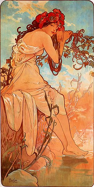
The popularity of the Art Nouveau movement at the turnoff the 19th century can be traced back to Czech artist, Alphonse Mucha. With a lithographed poster advertising the play Gismonda, that appeared on walls in Paris in1895, Mucha and his distinctive style were in the minds of the French public, and soon the movement spread, though it acquired different names depending on the country. In Prague for example, the style was incorporated into the local architecture and buildings designed in those years are still visibly encrusted with images of leaves and women that swirl across the facades. The movement was influenced by Japanese art, like wood block prints with their curves and use of colours, and similarities can be seen not in style as much as the techniques that were absorbed.
Art Nouveau was a short lived style, succumbing in the years leading up to the first world war, as it was one that explored sexuality as well, and this subversiveness and disregard for morality andsocial structure contributed to its downfall.

Malevich


At first glance the work of Kazimir Malevich seems to be simple, though his black square and black circle for example, are prime examples of suprematist design. Based on basic geometric shapes in various colours, suprematist design, which was founded by Malevich, focused on the “primacy of pure feeling in creative art” rather than the depiction of visual objects. Malevich believed that art could exist on its own without having  anything “to do with the object, as such”.
The simplicity of the forms might seem superficially to be similar to constructivist works, down at the core, their beliefs were in sharp contrast. Suprematism embodied a profoundly anti-materialist, anti-utilitarian philosophy. Reflecting the social changes that were going on in Russia at the time, going from a Tsarist monarchy to the Soviet state run by First Lenin and finally Stalin who restricted the artists of the
time in fear of their power. In Malevich’s self portrait, painted traditionally according to Stalinist cultural policy,  Malevich still signed it with a tiny black on white square defiantly.

Ludwig Mies van der Rohe


It takes work and talent to create minimalist designs that stand the test of time. One designer capable of such work was German-American architect Ludwig Mies van der Rohe. Now widely regarded as one of the pioneers of modern architecture, he began his career as an apprentice in Peter Brehren’s studio, working alongside esteemed modernists Walter Gropius and Le Corbusier. After World War 1, he began experimenting with styles of design that were suitable for the industrial age that the world was embracing.

He is most widely known for the design of the German Pavilion for the Barcelona International Exposition in 1929, using simple forms and extravagant materials. It was supposed to reflect the face of the new Germany after the war, culturally progressive, prospering and thoroughly pacifist. The use of space was meant to invite the weary visitors and blurred the distinction between inside and outside space. Unfortunately, since it was never meant to be a permanent installation, it was torn down less than a year later. However, thanks to Copies of the original plans and photographs, a group of Spanish architects have reconstructed it more permanently between 1983 and 1986. It now stands as a testament to the ingenuity and talent of a great modernist designer, always welcoming.

Olly Moss


The wonderful creations of Olly Moss an English artist, graphic designer and illustrator, have been floating around the internet for a while, garnering attention from people with an eye for simple movie posters that encapsulate and capture their essence. Moss is new to the professional graphics scene, having graduated from the University of Birmingham in 2008, but he started designing tshirts for sale while studying and first made a stir when he won a tshirt design contest with a design that spoiled the major plot twists of famous movies.
Since then, he has gone on to design more t-shirts, movie posters and has even had a show at Gallery 1988 in Los Angeles. Paper cuts as it was titled, collected pop culture icons from movies and games as well as comics and reproduced them in the style of Victorian portraiture.  Here and there a splash of colour stands out to emphasize some part of the character, like the smile of the Joker from Batman. Moss’s work has been likened to that of Saul Bass, and he pays homage to him in some pieces, as well as Romek Marber, whose work he has riffed on for some of his video game posters, Justin Ishmael, Mondo’s creative director (who commissioned most of the movie posters) thinks “he has a lot more range. Only Moss does Moss.” (2011)

Banksy


The artist using the pseudonym Banksy is famous for his anti establishment, anti-government stencil street art. His works frequently critique and bring to light the object oriented culture of modern society like in his piece Shop Till You Drop (Sa//y, 2011)
Depicting a woman falling or being dragged down by a shopping cart, it brings to light the rampant consumerism and spending in a time when it is at best questionable due to the economic situation in England.
Another of his works protested the fact that much of the Jubilee and 2012 Olympic memorabilia had been made in sweatshops, often by underpaid and underfed children. This sort of exploitation of the poor in the name of capitalism is nothing new, but in the past when it had come to light, such as with Nike in the 1990's protests were organizes and products had been boycotted until they took a closer look at their manufacturing. In recent times, Apple has come under fire for its factories in China where a number of suicides and terrible working conditions had come to light. The truth is that today, people would rather closet themselves with their gadgets than acknowledge the pain and suffering that is a byproduct and so something to change it. 

Reference
Sa//y. (2011) Shop Till You Drop. Flickr. [Online] Available at: http://www.flickr.com/photos/salsgallery/6417876715/in/photostream/ (Accessed 12 May 2013)

Dieter Rams


The man that made Braun a household name in the 1950's, Dieter Rams (Desgn Museum, 2009) is a designer that has greatly influenced today's world by way of both his products and his design philosophy.
At the core, Rams' designs are created with one main idea, Less is More. Rams asked himself "is my design a good design?" and the result of reflection on this was his Ten Principles of Good Design.


Good Design
is innovative
makes a product useful
is aesthetic
makes a product understandable
is unobtrusive
is honest
is long lasting
is thorough down to the last detail
is environmentally friendly
is as little design as possible

Rams was dissatisfied with the way product design was progressing in the 1970's and that is why he introduced the ideas of sustainable development and of the manufacturing and design of products to be environmentally friendly. These are ideas that modern designers are still coming to grips with, 40 years later, and not always succeeding.
Rams has acknowledged that Apple are one of the few companies that follow his principles, and he is cited as an influennce both for product design as well as a key influence to their chief designer Sir Jonathan Ive.

Reference
Design Museum 2009 Dieter Rams [Photograph]

Jony Ive


London born designer Sir Jonathan Ive (Dawes, 2012) is one of the names any self respecting design student should know, not only because the products he designs that are used every day, or the many awards and accolades he has won. The way he designs things, with an attention to detail and with the goal of concentrating and simplifying the essential elements of a design without limitations.
Ive's work is the subject of much love and hate, go on any computer forum and take a peek at the flame wars his products create. This reaction from the public as well as his talents mark him as one of the great and influential designers of the 21st century. After all is it not a hope of the designer to spark feelings in the hearts and minds of the people? 
His position as Senior Vice President of Industrial Design at Apple is another thing that sparks hope for the future of design in this world of shoddily assembled products planned with obsolescence in mind.
Apple now being a household name and Ive's association with its rise prove that design is an important part of any process and that companies should take note if they want to be as successful.

Reference
Dawes, M. (2012) Sir Jonathan Ive [Online]. Availoable at: http://marcusdawes.photoshelter.com/image/I00006Ts4_FCMxZI (Accessed 12 May 2013)

Shakespeare and Language


The last hundred odd years have seen the greatest shift in culture, technology and language arguably since the beginning of written language.  With this change, languages have evolved and mutated, sometimes within years ,  the meanings of words shifting with generations. One example of such a word is gay. If we look at its original meaning and associations, for example in Shakespeare's Richard II the usage is obvious in its referencing fun, cheerful, colourful, even exciting clothing, compared with that of a poorer person.
"My gay apparel for an almsman's gown" (1595, 3.3:1791)
By the late 1890's the term had an overall tinge of promiscuity, and in the late 1940's the term began to appear in psychological writing such as the Rorschach Research Exchange and Journal of Projective Techniques, published in 1947.
Since then, the word entered use in mainstream English and has been recognized as having several meanings in dictionaries. Now in the 21st century, with the advent of the internet, overuse of the word gay has shifted its meaning yet again, mostly among the youth, though it still retains its homosexual meaning. The present use, usually used to describe objects or events in slang indicates something rubbish or stupid, as in "that bike is gay".

Reference  
Shakespeare, S. (1595) Richard II. Edited by Wright, W.A. Cambridge: Macmillan and Co.

Modernist Furniture


While the era of modernist design has passed, proponents of its austere principles as well as products designed by them are still readily apparent in today's world. Modernist furniture designs have had a great effect on what is available today for the average consumer, as designs clearly influenced by modernist designs such as Marcel Breuer's Nest of Tables are for sale today.
Marcel Breuer's B9 Nest of Tables designed in 1925/26
Annika Grottell's KLUBBO Nesting Tables
Some companies such as Swedish giant IKEA still follow the modernist idea of form follows function, and emphasize simplicity not only in their furniture design, but throughout the whole enterprise, from packaging to assembly  instruction leaflets. The minimalist design aesthetic is one that still lives on in cities, especially ones that tend to have a limited living area, such as New York or London, as it helps give the impression of space. Modernist architects use of space or materials to create the illusion of space also pushed designers to create "furniture that was visually transparent, minimal in terms of bulk" (Wilk, C )
While modernist design might have been a bit too stark for some, the nature of the materials used had given the objects produced a certain tenacity and longevity, and as such, examples of modernist furniture, like the creations of Ray and Charles Eames are much sought after even today, fetching a pretty penny on the market.

Reference
Breuer, M. (1925/26) B9 Nest of Tables 
Grottell, A. KLUBBO Nesting Tables

Mississauga City Hall, Postmodernist Architecture


Postmodernisms rejection of the serious attitude of modernism can be linked to the end of World War 2 and the culture shift that took place in the following decades. The end of the war saw the rapid expansion of the middle class, thanks to the momentum of the economy and the rise of new buildings to accommodate them. However the modernist approach of one size fits all to urban design meant that when times got worse, they degenerated into slums and had to be torn down in some cases.
While modernist architecture was serious and monolithic, postmodern architects took a more playful outlook, and revived some of the more decorative design choices that had been minimized or even rejected by modernist, such as using columns and decorative facades purely for their beauty. They still used the materials that modernists had celebrated, steel and glass, but used them in such a way as to make buildings more aesthetically pleasing to the everyday man.
Ian Muttoo, 2007
Some building almost seem to poke fun at the seriousness, such as Mississauga City Hall in Ontario, Canada. This melding of European urban civic design and the rural styles of farmhouses stands tall and is a physical manifestation of the postmodernists rejoicing in diversity.

Reference
Muttoo (2007) Mississauga City Hall. Flickr [Online]. Available at: http://www.flickr.com/photos/imuttoo/2229840972/ (Accessed 12 May 2013)

Useless Machines by Bruno Munari


Bruno Munari's "useless machines" show off one facet of the designers many talents in design, but they are unique his and are one thing he is remembered for. 
Bruno Munari, Useless Machine (Arrhythmic Carousel), 1953,
Iron structure, gramophone mechanism and aluminium sheets, 113 x 60 x 30 cm.
Freeing geometric shapes from their static role in pictures or on canvas, Munari cut them out, painted them and displayed them using basic materials such as wood and string. Similar to childrens mobiles, and often used as such by his friends, these designs were a celebration of design being a part of life, something active, in motion, and the way Munari designed them makes this clear. Everything was balanced according to geometric rules so that the slightest touch of air would send the objects spinning and create delightful shapes and shadows, that varied with the lighting used as well.

Bruno Munari, Useless Machine , 1947

Whether the machines could be truly called useless is debatable, though Munari admits that the word useless was chosen because the machines didn't produce any goods, eliminate labour or increase capital (Munari, B, 2009).
 On the other hand though, the reactions they produce, while not physically tangible is one of pleasure and enjoyment simply in the ever changing art that they produce out of interaction with their environment.


Reference
Munari, B. (2009) Design as Art, London: Penguin Group UK.
Munari, B. (1947) Useless Machine, Private Collection
Munari, B. (1953) Arrhythmic carousel, Private Collection